Kiddooptical Brand Design
student project . Brand Design . May2024
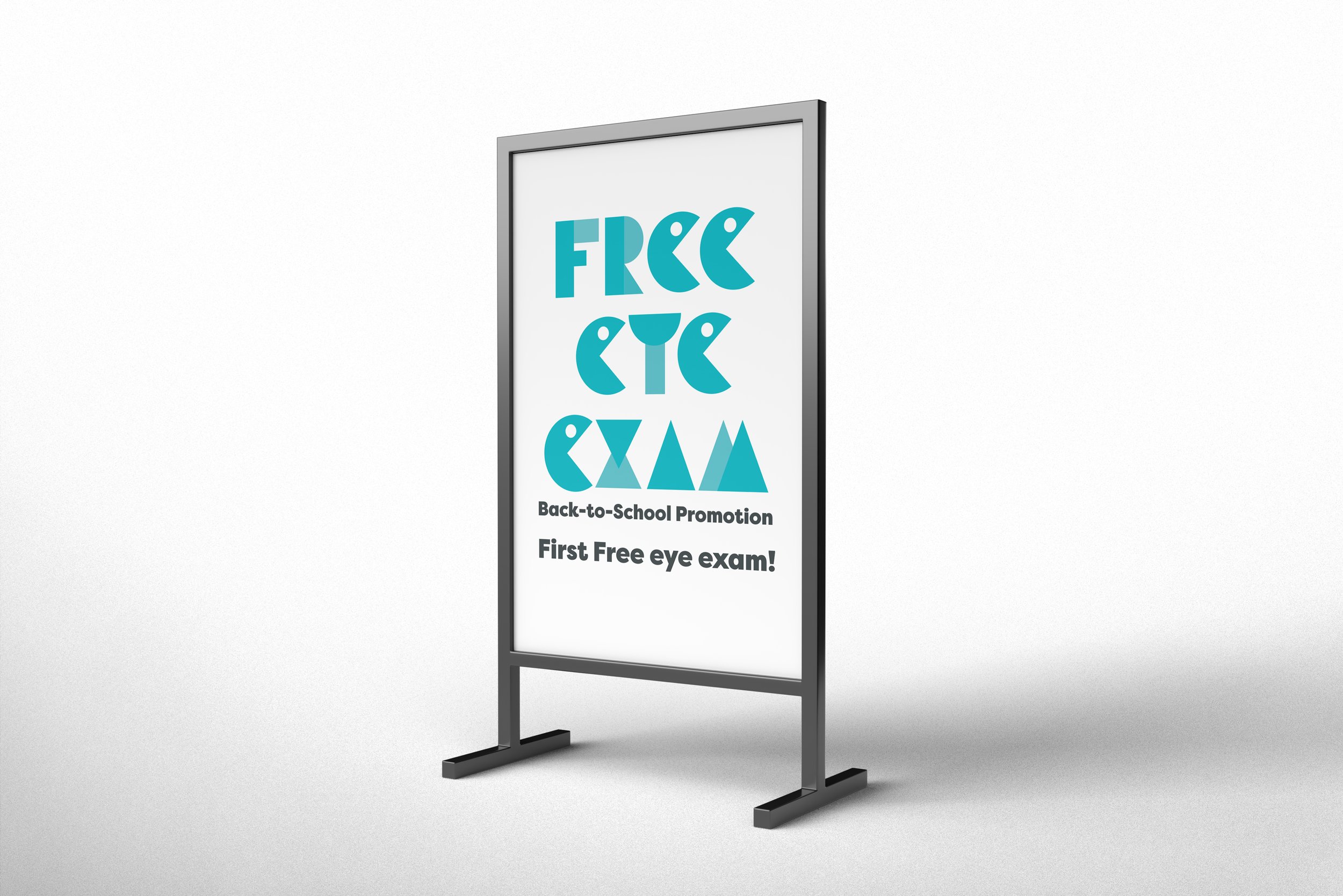
Kidooptical is a rebranded pediatric optometry clinic located in the Hastings-Sunrise neighborhood of Vancouver, BC. As part of this student project, I was tasked with identifying the essential needs of the community, highlighting pediatric optometry as a vital service for families. The rebrand aims to address the shortage of specialized optometric care for children in the area, providing vision therapy and support to those in need.
The new design embodies qualities of nurture, joy, and precision, aligning with the tagline, “Vision Nurtured.” The main color, a refreshing Aqua Blue, conveys trustworthiness and comfort, while the logo draws inspiration from the geometric shapes of building blocks, symbolizing clarity, focus, and precision.
This rebranding project seeks to create a welcoming and child-friendly identity for Kidooptical, emphasizing the importance of children’s eye health in the community.

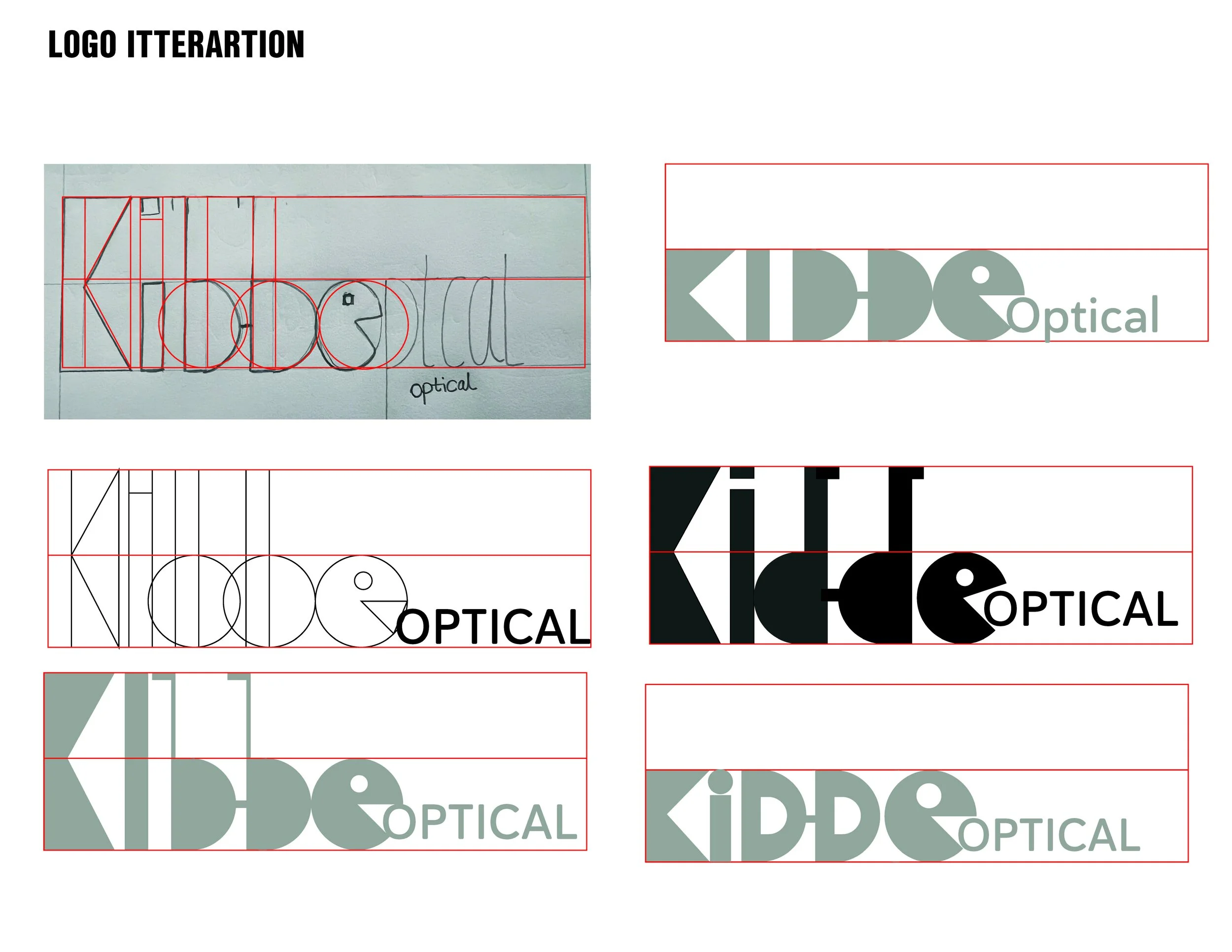
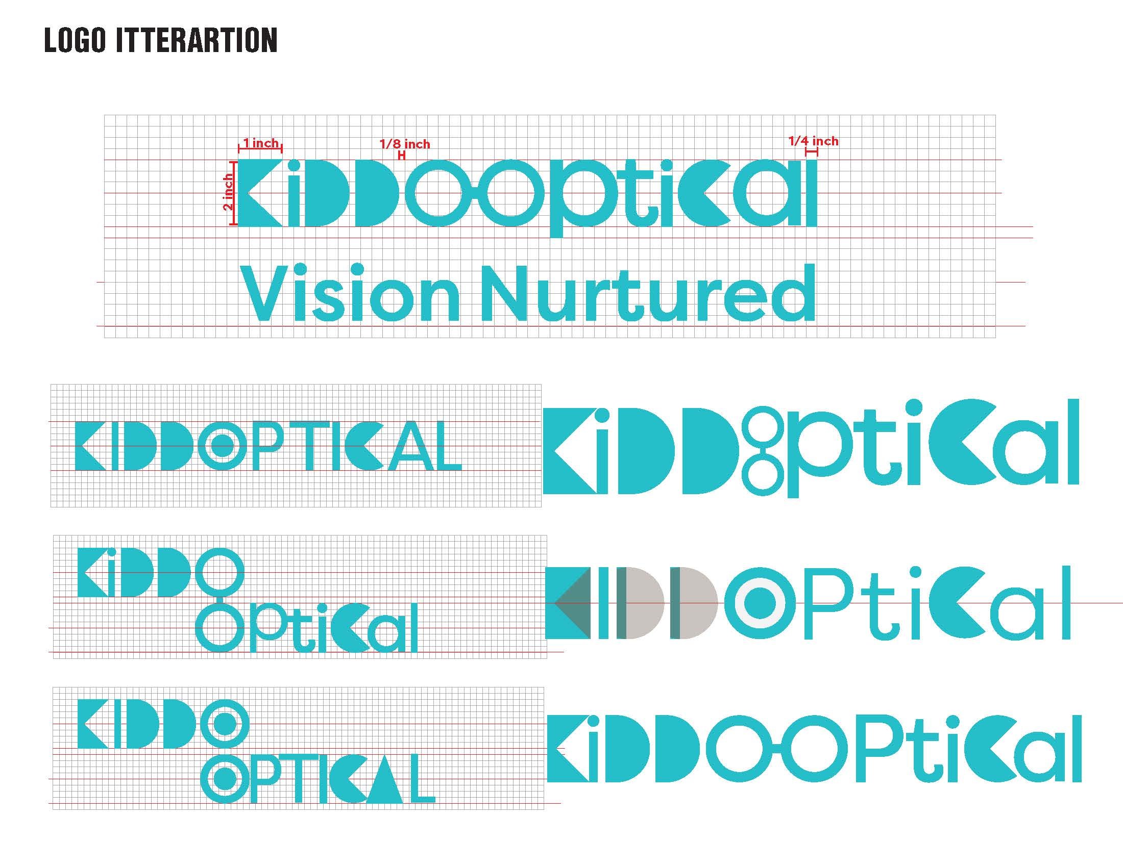
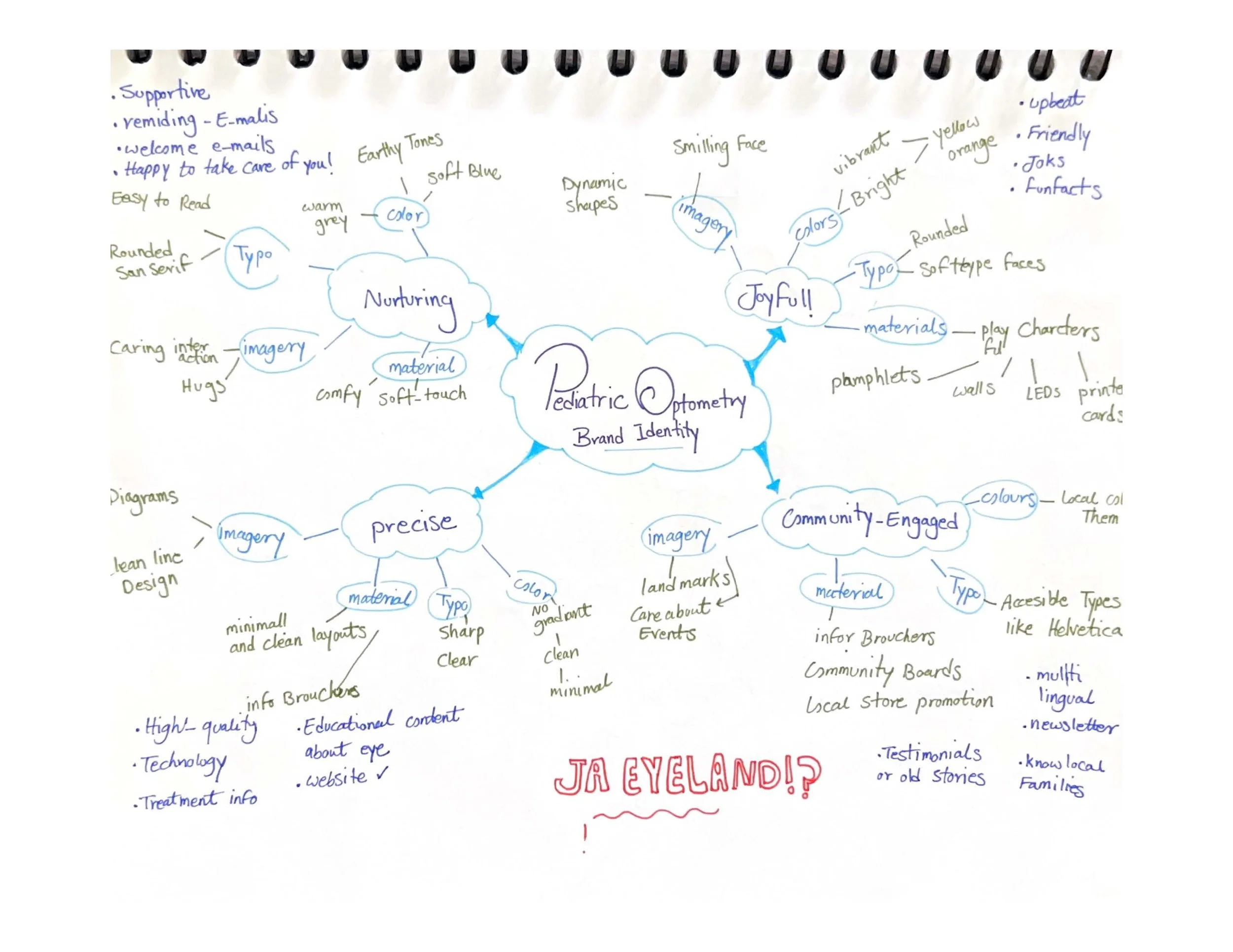
I have undertaken multiple steps to arrive at the final design, each reflecting critical stages of the design process.